Pulse: An Effective RSS Reader for the iPad
The best way to view and understand the iPad is to see it as a visual medium. When you hold it in your hand, it’s like you’re holding a magazine, flipping back and forth through content guided mostly by images and other graphics that grab your attention.
Thus for me, the apps that work best on the iPad are ones that have great visual appeal. Like it or not, images are the new way we read. Icons, logos, photos, and other graphic elements communicate more to us than entire books. The visual messages are endless. This I think in part is the appeal of the latest RSS feed app, Pulse (iTunes Store link).
I had put this app on my wish list a few weeks ago, but when Steve Jobs highlighted it in his WWDC keynote I thought I’d download and get a better look. I already have a couple of RSS readers (NetNewsWire and Early Edition) on my iPad, so I wasn’t in a hurry to download another one.
The Pulse Interface
All RSS Readers are pretty similar, but the difference with Pulse is that its interface tries to be visually-based, whereas with NetNewsWire (see the second screen shot below), the feeds are list/word-based. Pulse attempt to bring a magazine-style approach to an RSS feed.
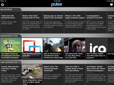
The issue is that not all feeds come with images, which takes away from the visual appeal of Pulse. Notice in the screenshot above the difference between feeds that include images and the ones that don't. The images can often convey the topic of the article faster than lists of titles.

Navigating Pulse
Another important element of the iPad is navigation. When we use the iPad or iPhone, we’re constantly tapping, swiping, and scrolling content on the screen. The less redundant tapping that we have to do—in my view—the better the app and experience as a user.
In this regard, feeds that consist of full posts rather than summaries mean one less tap that I have to make. Sorry to say, but AppleMatters‘s RSS feed, for example, is summary based, which means that readers have to tap on a title in its feed, and then tap again on the title of the summary to get access to the full article. In my mind, if you tap on the title in a feed, you are more than likely want to read or scan the full story.
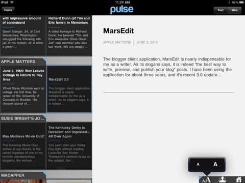
Feeds that offer full posts are at an advantage when read in Pulse, because the app gives you the option of reading articles in Text or Web mode. The text mode is similar to the new Reader mode in Safari 5.0. All the ads and surrounding content is stripped away so only the text is left to read. The articles of feeds that only offer summary posts can‘t be read in Text mode.
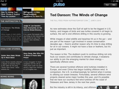
I also like how important menu elements are also placed where you can easily access them. So when you have the iPad in portrait position, a feed’s titles appear at the bottom of the screen, and the selected article is layered under the list. You scroll up and down to read the article, and you scroll left and right to scan the titles. In landscape mode, it works pretty much the same way.
The Home button is positioned in both the lower-right and the upper-left of the screen, again where you might more easily access them for navigation. When you don’t have to move your hand across the screen to reach a button, it makes for better navigation. It might useful, though, to include a way to press down on an open space in an article and have a contextual menu pop up so that you can navigate the reader.
The more standard features in Pulse include the ability to open selected articles in Safari, and to email and share links to articles in your Facebook and Twitter account.
The are a few significant cons to Pulse that I’m sure will be addressed in upcoming upgrades. For example, if you want to manually update feeds, you must close the app and re-open it. Otherwise, you have to wait until the feeds are updated, it seems, using Google‘s engine.
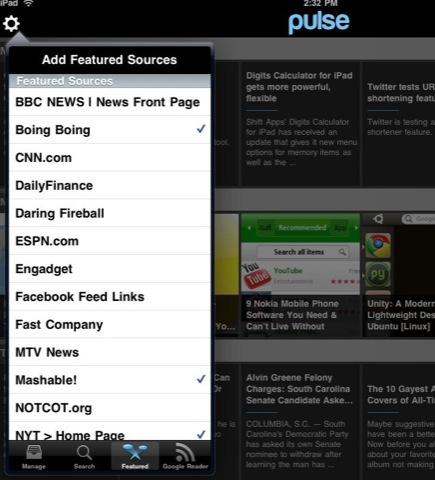
Adding source feeds, however, is really easy. By default the reader comes with a good list of featured feeds such as Engadget, Digg, and Mashable that you select to be added. If you use Google Reader, you can synchronize your selected feeds to be added to the list. You can of course do a search and add feeds that way as well. Finally, you can easily rearrange your list of feeds as well as selectively delete them.
I would say the biggest feature I would like to see added to Pulse, is the ability to customize the color of each feed. This is another visual element that would help in navigating to favorite feeds. You can customize the titles of feeds, so why not be able to colorize them as well.
Overall, Pulse—developed by two Stanford students—is a stylistically appealing iPad app that will improve over time. I certainly see why Jobs and Apple chose to highlight it at WWDC.
 del.icio.us
 Digg
Digg Facebook
 Slashdot
 StumbleUpon

Comments
Pulse has two big problems. First when you use your google account, you then have to pick which ones to have pulse read. So it’s a two step process instead of simply being synced. The second problem is pulse can’t handle a lot of feeds. All the graphics and pretty things max it out at about 20. I bought it without realizing this limitation and my 60 or so feeds from google reader that news rack handles just fine made pulse choke. Unfortunately no way to get my money back (thanks app store) so it’s just a waste of money for me.
Kris, sorry to hear that app isn’t what you expected. If it’s any consultation, I actually purchased myself. I didn’t get review license for it. As for the Google feeds, I wasn’t annoyed by that because I didn’t want to add all of them to the Pulse reader.
Nevertheless, thanks for your comments. Hopefully they will give other possible readers something to think about.
Maybe they’ll figure out a way to not have these limitations because graphically speaking the interface is outstanding.
I cant wait to fix this bugs. Then will be complete machines
This is where the indsutrial ice machine comes to the rescue and turns out ice real fast. How fast? In 10 minutes. The portable Ice Maker has a reservoir that can hold 2 liters of water and is capable of producing 12 large ice cubes every 10 minutes. The Ice Maker has options where you can choose the size of the ice cubes including small, medium, and large.
This is very interesting, I think Apple has the great products on the market and people are enjoying all of them. Asigurari auto