Musings about Snow Leopard, Safari, and iTunes
When it comes to Apple, there's always something to write about. Its Michael Jackson-popularity is so grand that I keep looking for Steve Jobs or the Apple logo to show up on the pages of People Magazine with pages of gossip, assorted company party photos, brief articles about its love-hate relationship with Google, it's over-the-top iPhone sells, and its yet again stellar operating system upgrade.
So in this week's column, I'm going to muse about a few Apple matters that have been occupying my mind. Off the top, I can't say enough about one of the best investments I've made in computer software this year, which is the $25 (Amazon price) Snow Leopard upgrade I installed on Monday.
Unless Apple was going to revolutionize its operating system with something vastly different from the original OS X, I didn't want just another upgrade of features that would make the system bloated. Instead, Snow Leopard brings fewer new features but more speed and stability.
Rarely do we see major companies improving on the efficiency of their products. Usually, they add more bells and whistles to woo customers, while putting less emphasis on the quality of the product itself. With Snow Leopard, folders pop open; Aperture 2.0 (with thousands of RAW files in its library) opens in under 10 seconds; Web pages download faster, email flies out quicker, and my computer boots like it's eager to start working. There are still many system issues that Apple could improve upon, but as of this update this kind of efficiency gets more pros than cons.
Safari vs. Opera
While I'm relishing the speed of Snow Leopard, I can't say the same thing for Safari 4.0. Yes, it has speed, but after several years of making it my default web browser, I'm looking to park it in the backyard. Not that it's a piece of junk, but it's just not serving my needs for navigating the Internet.
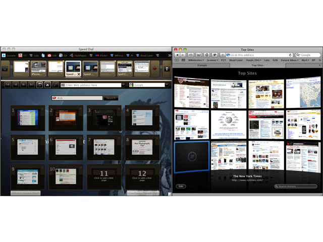
The entire experience of web browsing, I think, is a visual process, whereby countless images, icons, symbols, colors, buttons, and short keystroke activations drive us from website to website, from one link to another. With Safari, web browsing can get a little messy. I always have way too many windows or tabs open, and it takes me a wee bit extra time to locate bookmarks, even the ones in the menu bar.

With the recently released Opera 10.0, I'm finding web browsing less of a hassle. I didn't care much for prior versions of Opera, but when I downloaded Opera 10 Release Candidate last week, I was attracted to its features. Opera 10's more visual user interface makes Safari look and feel outdated. Opera features include options for visual tabs, visual bookmarked icons or favicons, and visual skin customization of the interface itself. The tab and bookmark bars can be moved around (top, bottom, left, right). Sets of tabs can be saved as sessions for later use, and the bookmark, history, and other panels are easily accessible. Finally, there's advance features for quickly searching keywords found in recently downloaded pages, as well as keyboard shortcuts for searching sites directly from the address field or standard search field.
Opera 10 is not perfect. 1Password can't be used with it, but it does have its own password manager that works similarly to 1Password. So far the work of setting up Opera 10 and making transition from Safari has been worth the effort. As much as I've enjoyed the simplicity of Safari over the years, it no longer fits my needs for web navigation.
iTunes 9?
On September 9th, Apple will hold a special software and hardware promotion media event, titled Rock and Roll. No doubt, upgrades of the iPod touch, iTunes, and the iTunes Music Store will be announced.
Though iTunes is very popular, I've met several Mac users who still can't wrap their heads around all that iTunes and the iTunes Music Store have to offer. Some might see iTunes as bloated or feature-rich, but I think it must continue to offer various options for different types of users if it is to remain a competitive digital jukebox and music downloading store. Alternatives to both are widely and more competitively available, meeting the needs of users who seek mobile and web access to their song collections; and of course in the age of Facebook and Twitter, many users can be found on sites like Lastfm, Lala.com, and Pandara.com-the kind of social networking missing in iTunes.
So it will be no surprise to see Apple trying to build greater connections with more computer savvy users who know that iTunes is not the only game in town. I for one have spent most of my music listening time on Lala.com, in the last month since I joined. Mainly it's because Lala offers greater access to my music than iTunes currently does, and because I can purchase and download songs cheaper, either through web-based purchases of about .07-.10 cents per song, or through mp3 downloads that are often a dollar or two cheaper than the iTunes Music Store.
Plus, to put it bluntly, Apple's music store simply is not the place I want to hang out, not even to read customer feedback. Purchasing iPhone apps is about the only reason I still visit the store.
So it will be interesting to see just how much rock and roll Apple brings to the digital music landscape next week.


Comments